Creating a seamless shopping experience on Shopify is critical in today’s mobile-first world. With most online traffic coming from mobile devices, optimizing your image banners for mobile speed has never been more important. Poorly sized or unoptimized banners can lead to slow loading times, frustrated users, and lost sales opportunities. By understanding the best size for Shopify image banners on mobile and implementing proven optimization techniques, you can enhance your store’s performance, improve user satisfaction, and boost your SEO rankings. This guide dives deep into everything you need to know to get your Shopify banners mobile-ready and lightning-fast.
Get 3 days free, then 1 month for €1
Best Shopify Image Banner Size for Mobile Speed Optimization in 2024
In 2024, the importance of mobile speed optimization for Shopify stores cannot be overstated. A fast-loading site ensures better user experience, lower bounce rates, and higher conversions. One critical aspect of optimizing your Shopify store is selecting the best Shopify image banner size for mobile speed optimization. This article will guide you through the recommended image dimensions, optimization techniques, and best practices to make your store mobile-friendly and efficient.
Why Optimizing Shopify Image Banners for Mobile Is Essential
Mobile shoppers expect quick-loading, visually appealing websites. If your image banners are not optimized:
- They can slow down your page load time.
- Affect your Core Web Vitals, which directly impact your SEO rankings.
- Lead to a poor shopping experience, reducing conversions.
Optimizing your Shopify banners ensures that your site is fast, functional, and visually attractive on mobile devices.

Recommended Shopify Image Banner Size for Mobile
The ideal Shopify image banner size for mobile is 1200 x 600 pixels. This size offers a good balance between high resolution and quick load times while maintaining a 2:1 aspect ratio.
Key Considerations for Image Banner Size
- File Size: Ensure the file size is under 200 KB for optimal load speed.
- Aspect Ratios: While 2:1 is standard, check your theme’s requirements. Popular aspect ratios include:
- 16:9 for widescreen images.
- 4:3 for classic banner styles.
- 1:1 for square visuals.
Best Practices for Shopify Image Banner Optimization
1. Use the Right File Format
Choosing the correct file format ensures a balance between quality and speed:
- JPEG: Best for photographic banners with gradients.
- PNG: Ideal for images with transparent backgrounds.
- WebP: Recommended for the best quality-to-size ratio.
2. Compress Images
Use tools like TinyPNG, ImageOptim, or Shopify’s built-in features to compress images without losing visual quality. Compression reduces file sizes and speeds up loading.
3. Responsive Design
Create multiple banner sizes for different devices. While Shopify themes often resize images automatically, uploading mobile-specific versions ensures better clarity and speed.
4. Optimize Alt Text
Alt text improves accessibility and SEO. Use descriptive, keyword-rich phrases. For example:
- “Shopify mobile image banner optimized for 1200 x 600 pixels to enhance speed and user experience.”
How to Upload Optimized Image Banners to Shopify
- Log in to your Shopify admin panel.
- Navigate to Online Store > Themes > Customize.
- Locate the Banner Section for your desired page.
- Upload your optimized banner (preferably 1200 x 600 pixels).
- Preview the changes across desktop and mobile views.
- Save your settings and test the load time using tools like Google PageSpeed Insights.
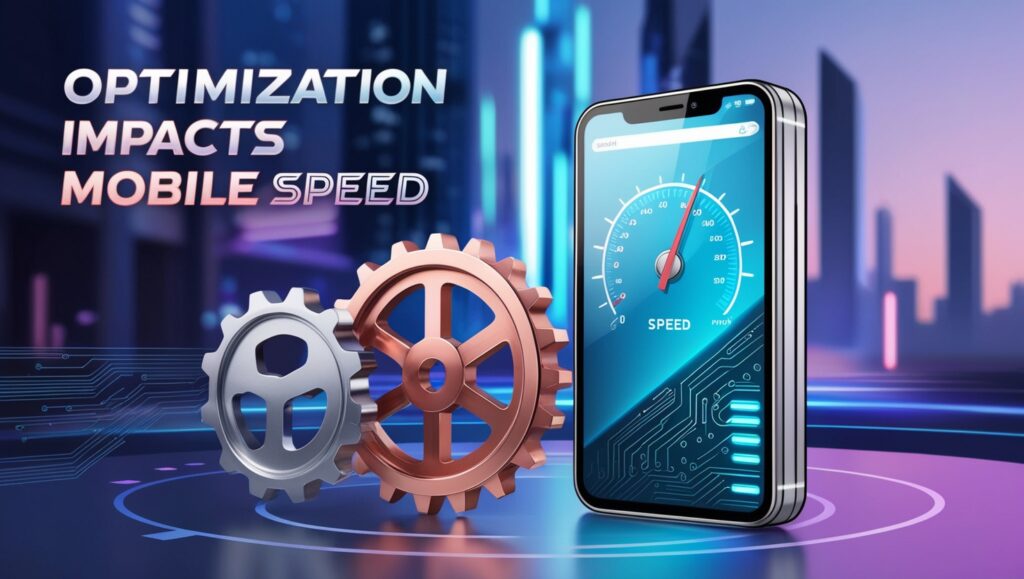
How Banner Optimization Impacts Mobile Speed
When your banners are optimized:
- Mobile users experience faster load times, improving their browsing experience.
- Your store ranks higher in search engines due to better Core Web Vitals.
- You reduce data usage for customers, making your store more accessible on slower networks.
Case Study Example
One Shopify store reduced its bounce rate by 20% after compressing banner sizes and switching to a 1200 x 600 pixel standard. This simple optimization boosted their sales by 15%.
Tools for Image Banner Optimization
- Canva: Design and resize banners effortlessly.
- TinyPNG: Compress PNG and JPEG files while maintaining quality.
- Adobe Photoshop: For advanced editing and optimization.
- Google PageSpeed Insights: Test load speeds and identify areas for improvement.
Conclusion
The best Shopify image banner size for mobile speed optimization in 2024 is 1200 x 600 pixels. By following this guideline and implementing best practices like compression, responsive design, and file format selection, you can enhance your Shopify store’s performance, improve mobile user experience, and boost SEO rankings. Don’t overlook this critical step in creating a fast, visually stunning online store.
How to Optimize Shopify Image Banners for Faster Mobile Performance
Optimizing your Shopify image banners for faster mobile performance is crucial for providing an excellent user experience, improving load times, and enhancing your store’s SEO rankings. Mobile users expect seamless navigation and quick-loading content, and poorly optimized image banners can hinder this. Here’s a step-by-step guide to ensure your Shopify banners are perfectly tailored for mobile speed and performance.
Why Optimizing Shopify Image Banners for Mobile Performance Matters
Mobile-first indexing by search engines like Google means that the performance of your mobile site is a key factor in SEO rankings. Slow-loading banners can:
- Increase bounce rates.
- Reduce conversion rates.
- Negatively impact your Core Web Vitals, such as Largest Contentful Paint (LCP) and First Input Delay (FID).
By optimizing your image banners, you create a faster, more engaging experience that keeps users on your site longer.

Step 1: Choose the Right Image Dimensions
The ideal banner size for mobile Shopify stores is 1200 x 600 pixels. This size balances visual clarity with file size, ensuring the image looks sharp on smaller screens without slowing down load times.
Best Practices for Image Dimensions:
- Stick to a 2:1 aspect ratio for banners.
- Check your Shopify theme’s documentation for specific recommendations.
- Create multiple versions of your banner for responsive design, including desktop and tablet sizes.
Step 2: Compress Your Images Without Losing Quality
Large image files are one of the biggest culprits for slow mobile speeds. Use compression tools to reduce the file size while retaining image quality.
Recommended Tools:
- TinyPNG: Great for compressing PNG and JPEG files.
- ImageOptim: A tool for macOS that compresses images without sacrificing clarity.
- Shopify’s Built-In Optimizer: Upload your images directly into Shopify to take advantage of its optimization features.
Best Practices:
- Aim for file sizes under 200 KB for mobile banners.
- Convert images to the WebP format, which offers better compression and quality.
Step 3: Use Lazy Loading
Lazy loading is a performance-enhancing technique where images load only when they are about to appear on the user’s screen. This reduces the initial load time for your site and prioritizes above-the-fold content.
How to Enable Lazy Loading in Shopify:
- Navigate to your Themes > Edit Code section.
- Add the lazy loading attribute (
loading="lazy") to the<img>tags in your banner code. - Save and preview your store to confirm it works.
Lazy loading ensures faster mobile performance, especially on image-heavy pages.
Step 4: Optimize Image Alt Text for SEO
Adding descriptive and keyword-rich alt text to your banners not only improves accessibility but also boosts your store’s SEO. Use alt text to describe the image clearly while incorporating focus keywords.
Example of Good Alt Text:
“Responsive Shopify image banner optimized for mobile speed, showcasing 1200×600 pixels.”
Avoid generic alt text like “banner image” or “shop banner.”

Step 5: Use High-Performance File Formats
The file format you choose can make a significant difference in image load times. For Shopify banners, the best formats are:
- JPEG: Ideal for photos and complex images.
- PNG: Best for images requiring transparency.
- WebP: A modern format with superior compression, supported by most browsers.
Switching to WebP can significantly reduce file size while maintaining quality.
Step 6: Test Mobile Performance Regularly
Use tools like Google PageSpeed Insights and GTmetrix to analyze your Shopify store’s mobile performance. These tools provide actionable recommendations to enhance load times.
Metrics to Focus On:
- Largest Contentful Paint (LCP): This measures how quickly your banner appears.
- First Input Delay (FID): Indicates how responsive your site is to user interactions.
Regular testing ensures your optimization efforts remain effective.
Additional Tips for Faster Mobile Performance
- Host Images on Shopify CDN: Shopify’s Content Delivery Network (CDN) automatically caches and delivers images faster.
- Avoid Excessive Text Overlays: Keep text minimal to ensure readability and faster rendering.
- Enable Shopify’s Image Lazy Loading by Default: Many themes support this feature out of the box.
Conclusion
Optimizing Shopify image banners for faster mobile performance is essential for retaining visitors, increasing conversions, and improving your store’s SEO. By using the right image dimensions, compressing files, enabling lazy loading, and adopting best practices like using WebP formats and testing performance, you ensure your store delivers a seamless experience for mobile users.
Implement these strategies today to elevate your Shopify store’s mobile performance and stay ahead in the competitive e-commerce landscape.
Ideal Shopify Banner Dimensions for Mobile
When designing a Shopify store, your banners play a critical role in creating a strong first impression. However, without optimizing them for mobile devices, you risk slow page loading times and a poor user experience. Selecting the ideal Shopify banner dimensions for mobile ensures your images load quickly, look professional, and engage your audience effectively. In this guide, we’ll discuss the best dimensions, file sizes, and design practices to create mobile-friendly banners.
Why Banner Dimensions Matter for Mobile
Mobile screens are smaller and have different resolutions compared to desktops. An image that looks perfect on a computer may appear cropped, distorted, or blurry on a smartphone. By using the right dimensions, you ensure:
- Faster page load times, improving SEO rankings.
- Better user experience, leading to higher conversion rates.
- Consistent branding across all devices.

Recommended Shopify Banner Dimensions for Mobile
1. Optimal Banner Size
The recommended banner dimensions for mobile are 1200 x 600 pixels. This 2:1 aspect ratio ensures that the image is wide enough to fit most smartphone screens without unnecessary cropping.
2. File Size
Keep your file size below 200 KB to maintain fast loading speeds. Use compression tools like TinyPNG or ImageOptim to reduce file size without losing quality.
3. File Format
Choose the best file format for your needs:
- JPEG: Ideal for complex images with gradients or photographs.
- PNG: Best for images with transparent elements.
- WebP: The most efficient format, offering high quality at smaller sizes.
Designing the Perfect Mobile Banner
To make your Shopify banners mobile-friendly, follow these design tips:
1. Use Simple and Clear Visuals
Avoid cluttered designs. Use bold fonts, minimal overlays, and high-contrast colors to ensure readability.
Where to add an image: Insert an example of a clean, mobile-optimized banner with bold text and minimal elements.
2. Focus on the Central Area
Mobile devices often crop the sides of an image. Place your main elements, such as text or logos, in the center to avoid losing important details.
Where to add an image: Add an example of a banner with centered elements to illustrate the importance of layout.
3. Prioritize High-Quality Images
Low-resolution images can look pixelated on modern screens. Use high-quality visuals optimized for mobile dimensions to maintain professionalism.
How to Optimize Shopify Banner Images for Mobile
1. Compress Images
Reducing file size is essential for mobile speed. Use Shopify-supported formats like WebP and compress images to minimize loading time without sacrificing quality.
2. Enable Lazy Loading
Lazy loading ensures banners load only when they appear on the user’s screen. This reduces initial page load times and enhances the user experience.
3. Test Across Devices
Preview your banner on different devices to ensure it displays correctly. Shopify’s customization tools allow you to switch between desktop and mobile views easily.
Responsive Banner Strategies for Shopify
To achieve optimal results, use responsive design strategies:
- Create multiple banner sizes: Prepare separate banners for desktop and mobile to ensure they fit each screen perfectly.
- Use scalable images: Vector-based graphics (like SVG) can adapt to different resolutions without losing quality.
- Adjust text size for mobile: Keep text readable and avoid using small fonts.

Tools to Create Mobile-Friendly Shopify Banners
Use these tools to design and optimize banners:
- Canva: Easy-to-use design software with pre-set templates.
- Photoshop: Advanced editing tools for professional results.
- TinyPNG: Compress images to reduce file size.
Conclusion
Optimizing your banners with the ideal Shopify banner dimensions for mobile is essential for creating a fast, visually appealing, and user-friendly online store. Stick to the recommended size of 1200 x 600 pixels, focus on clear and simple designs, and compress files for faster load times. By following these best practices, you can ensure your Shopify store performs seamlessly on mobile devices, keeping your customers engaged and boosting conversions.
Ultimate Guide to Mobile-Friendly Shopify Image Banners: Size, Tips, and Tools
In today’s e-commerce landscape, ensuring that your Shopify store is optimized for mobile users is crucial. With a large portion of shoppers browsing and buying via mobile devices, your store’s image banners must be mobile-friendly, visually appealing, and fast-loading. In this ultimate guide, we will explore everything you need to know about creating mobile-friendly Shopify image banners, including the best sizes, optimization tips, and essential tools to ensure top performance.
Why Mobile-Friendly Shopify Image Banners Matter
As mobile commerce continues to dominate, having well-optimized image banners is more important than ever. Mobile users expect fast load times and smooth browsing experiences. Slow-loading banners can increase bounce rates, lower conversion rates, and negatively impact your store’s SEO rankings.
Optimizing Shopify image banners for mobile can:
- Improve page load speed, resulting in a better user experience.
- Enhance SEO performance, as Google rewards mobile-friendly websites with higher rankings.
- Drive higher conversion rates due to faster loading and more visually appealing designs.

Best Size for Shopify Image Banners on Mobile
Ideal Image Dimensions for Mobile
When optimizing Shopify banners for mobile, size is a key factor in ensuring quick load times and a visually appealing design. The recommended image size for mobile-friendly Shopify image banners is 1200 x 600 pixels. This size ensures that the image is large enough to appear crisp on most mobile devices while being small enough to load quickly.
Why 1200 x 600 Pixels?
- Aspect Ratio: The 2:1 aspect ratio works well across various screen sizes.
- Optimized for Mobile: At this resolution, banners look sharp on mobile without compromising page load times.
While 1200 x 600 is ideal, always check your Shopify theme documentation, as some themes may have specific image size requirements.
File Size Considerations
The file size of your banner is just as important as its dimensions. Large image files can significantly slow down load times, especially on mobile networks. For optimal performance, aim to keep your image banner file size under 200 KB.
Image Formats for Mobile
Choosing the right file format can also impact load times. Here are the best options:
- JPEG: Ideal for photographs or banners with many colors.
- PNG: Perfect for images with transparent backgrounds.
- WebP: This modern format offers superior compression and faster loading times while maintaining high image quality. Shopify supports WebP images, so it’s a great choice for mobile optimization.
How to Optimize Shopify Image Banners for Mobile Speed
1. Compress Images Without Losing Quality
Image compression reduces the file size without sacrificing image quality. You can use online tools like TinyPNG or JPEG-Optimizer to compress your image files. Shopify also supports WebP format, which is a more efficient file format that compresses images even further, resulting in faster load times.
Suggested Image Compression Tools:
- TinyPNG: Compresses PNG and JPEG images while maintaining high quality.
- ImageOptim: A great tool for Mac users that helps reduce image file size without losing quality.
2. Enable Lazy Loading for Images
Lazy loading ensures that images are only loaded when they are about to appear on the user’s screen. This improves the page’s initial load time and saves bandwidth, especially on mobile devices with slower connections.
Shopify supports lazy loading for most themes, but make sure to enable it in your theme settings or use an app like LazyLoad to ensure images load efficiently.
3. Test Image Load Times
Regularly test your Shopify store’s performance using tools like Google PageSpeed Insights or GTmetrix. These tools provide valuable insights into your page’s load speed and give suggestions on how to improve performance. For mobile optimization, aim for a load time of under 3 seconds.
4. Use Descriptive Alt Text for SEO and Accessibility
Adding alt text to your image banners is essential for both SEO and accessibility. It helps search engines understand the content of the image and provides a description for users who rely on screen readers.
For example, for a mobile image banner showcasing a summer sale, you might use alt text like:
“Mobile-friendly Shopify banner promoting summer sale with 1200 x 600 pixel dimensions.”
Best Practices for Designing Mobile-Friendly Shopify Image Banners
1. Keep It Simple
Mobile screens are smaller, so avoid cluttered designs. Focus on bold, clear visuals and minimal text. Ensure that the most important information, such as a call-to-action (CTA), is easy to read and located in the center of the banner.
2. High-Contrast Text and Background
Make sure the text on your banner is legible on all screen sizes. Use high-contrast text and background colors. This not only improves readability but also helps your banner stand out on mobile devices.
3. Use the Center for Important Content
Mobile devices may crop the edges of your image, so it’s important to keep essential content like logos, CTAs, and key product details in the center. This ensures nothing critical is cut off on smaller screens.
4. Limit Text
Keep text minimal and focused on the most important message. Mobile users are likely scanning, not reading long paragraphs, so use short and impactful phrases.
Tools for Optimizing Shopify Image Banners
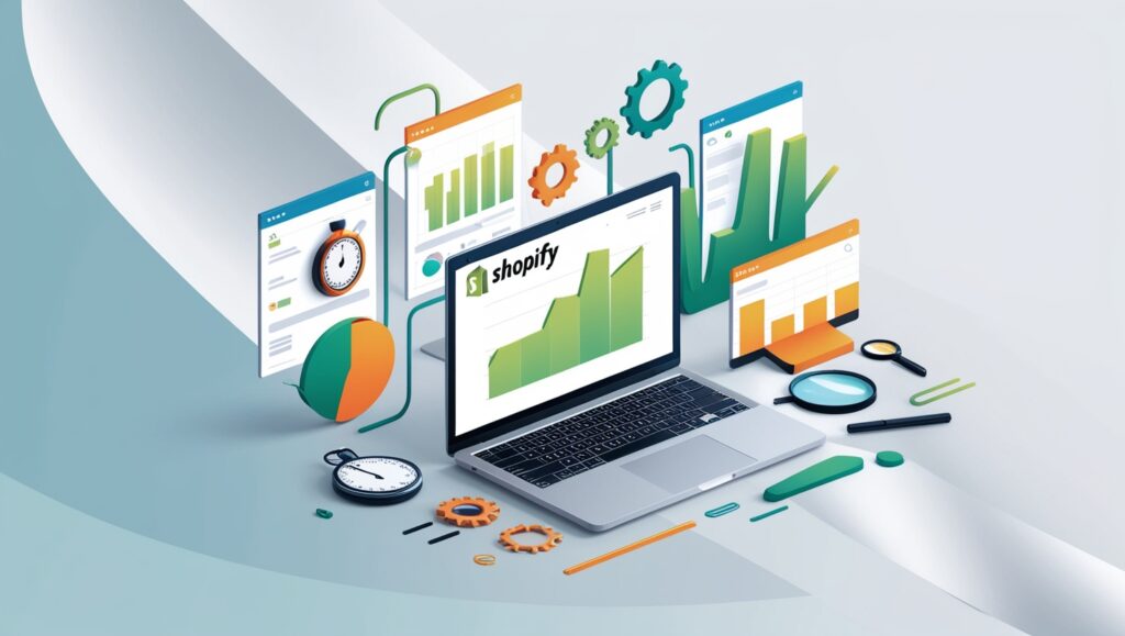
There are several tools available to help you optimize your Shopify image banners for mobile. Here are some essential tools you should consider:
1. Shopify Image Editor
Shopify’s built-in image editor allows you to crop, resize, and adjust the quality of your banners. This tool is handy for basic optimizations and ensuring your images meet the required dimensions.
2. TinyPNG
TinyPNG is an excellent tool for compressing both PNG and JPEG images without losing quality. It reduces the file size of your images, ensuring they load faster on mobile devices.
3. ImageOptim (Mac Users)
For Mac users, ImageOptim is a great tool for image compression. It reduces file sizes efficiently while maintaining the original quality of the images.
When to Add Images
Throughout the article, it would be beneficial to include images for visual clarity and better understanding:
- Before and after comparisons of image optimization (e.g., file size reduction, quality comparison).
- Screenshots of the Shopify theme editor, showing where to upload image banners.
- Infographics explaining the best practices for mobile image banner design.
- Charts or examples demonstrating ideal image sizes and formats for mobile banners.
Conclusion
Optimizing Shopify image banners for mobile is a crucial step in improving your store’s speed, user experience, and SEO performance. By selecting the right banner size (1200 x 600 pixels), compressing images, and following design best practices, you can ensure your Shopify store delivers a seamless experience for mobile shoppers. Take the time to implement these tips and tools, and watch your store’s performance and conversions improve.

